Thursday, September 28, 2006

How-To: Floating in Space

In lieu of giving an assignment this week, I'll explain how I did a photo project, so that you can do something similar if you want. For this one, I wanted to take a small subject and completely isolate it from the background. This way, it really pops.

You can do this with anything small enough so that you can put a solid-color background behind it. You might even be able to transfer some of what you learn from this post to other contexts.

First, decide what your subject will be. I chose a sea shell. I did make one mistake, though. You should pick a background that contrasts very well with your subject. Since the shell had warm tones, I should have used a blue shirt. But I did get by with the red one. Put your subject on a background that contrasts with it. You could use a t-shirt, or construction paper, or whatever else you have available.

Frame your picture so that the subject fills the entire frame. Don't worry about composition, because with this project it'll be easy to change that in post-production. But do get a good angle on your subject. Because of the way I wanted it to turn out, I underexposed the shot by 2/3 of a stop, but that might not always be what you want to do.

Now that you have your original picture, take it into Photoshop. Use the magic wand tool, and click in your background. If this doesn't select all of your background, increase the tolerance. If it selects part of your subject, decrease the tolerance. As soon as you've selected as much of the background as possible without selecting any of your subject, hit the "delete" key. Now, you may need to go in and clean up the edges a bit by selecting a few pixels here and there and deleting them. Do this at 100% magnification, and go over the whole picture meticulously.

Now, zoom out again. If you don't like the white background it gave you, fill the area with whatever other color you want. If you want to change the composition, increase the size of your canvas, move the subject wherever you want it, and fill the remaining area with the same color you used before.

Now, I used a black background. You don't have to, but you should probably use either black or white if you want the picture to be black and white. If you want the picture in color, you need read no further. You have your pic! But if you want a high-contrast black and white like I do, read further.

Go to Layers-->New Adjustment Layer-->Hue/Saturation. Click OK, then click OK again. Go back and create another layer: Layers-->New Adjustment Layer-->Hue/Saturation. Click OK, but this time take the saturation slider all the way down to 0 and then click OK. Change the blend mode to color (in your layers palette, there should be a drop-down menu that says "Normal"; just click that and find "Color"). Double click on the first layer I told you to add, and mess with the hue slider until you get a look that you like.

Here's my result:

Murex Shell
(this is available through Art.com and Fotolia)

Now, if you do this, show me what you get!

Wednesday, September 27, 2006

Light: Quality and Quantity

Most of the time, while taking photographs, we only think in terms of whether there is enough light, how it affects our camera’s settings, and whether we will have camera shake. But just as important to getting good photos is the quality, rather than the quantity, of the light.

To understand this concept, perhaps it’s easiest to think of a sunset. When the sun is very low on the horizon, the sky around it turns red. When the sun is highest in the sky, the sky is very blue. But clearly this isn’t an instantaneous change. At times earlier or later in the day, the light is warmer (more red). Toward the middle of the day, the light is cooler (more blue). This affects your color balance in your camera, for one thing (a digital camera will usually automatically compensate, but film can’t do this, so the colors may be wrong if you shoot at the wrong time of day).

So if you’re shooting with a digital camera, you won’t have to worry too much about the color shift caused by shooting at different times of day, although it may be an issue and you may have to override your camera’s automatic white balance.

A related issue is the problem of too much light. You may not think this is possible, but it is. Imagine you are shooting in very dark light. Your picture will have very little contrast, i.e. the overall tone will be in similar shades of gray. As more light enters the scene, more contrast will show up in your pictures. During the brightest sunlight, this hits the extremes--and your camera can’t pick up the full range of tones like your eyes can. Your pictures will have areas of extreme light and dark, but the middle range will be left out. The problem is bad enough when you’re shooting in black and white, but it gets even worse in color, because the colors will also have too much contrast, and no middle range. See this shot for an example:

Milo

That’s what to avoid.

So, taking all this into account, what should you do? My recommendations:
- shoot in the hour before, and two hours after, sunrise, and the two hours before, and the hour after, sunset
- shoot on partially cloudy days
- on completely overcast days, shoot up-close subjects; you won’t cast a shadow, and the colors will be nicely saturated, so if you get the right exposure, the colors will really come out
- find shaded areas to take pictures of, like the shaded side of a building; be careful, though: if any unshaded areas get in your frame, they’ll be completely washed out
- if it’s really sunny, I’ve heard that some people will put an umbrella over their subjects (e.g. flowers)
- failing all that, try a warming filter over the lens of your camera

Monday, September 25, 2006

Useful Flickr Groups

Getting feedback is one of the most important things you can do to hone your skills as a photographer, after actually doing it and being critical of your own work.

And Flickr has some interesting groups that are great for getting feedback on your work. Sure, I'll review your work and give you feedback, but if I'm too slow, or you think I'm all washed up, or you just want more opinions, you should check some of these out.

Score Me! is a group that allows you to post a picture and get five ratings on it from other people, on a scale of 0-10. You must also give ratings on the five pictures that were posted before yours, or you'll get kicked out of the group really fast. The admins are very good here, and there is a thread you can post to if you want to report a rulebreaker, and another one to get the scores you missed. Also, make sure not to post another picture until five others have been posted! This one is only somewhat useful if you want some real feedback, since the group doesn't require anything more than just a rating, but many people there will give you good feedback. The best part is that you can strive for a high score, and if you get a high score you can post your pic in one of the appropriate threads reserved for high-scoring photos.

Plus-minus comments is a group with an excellent premise. It's much like Score Me! (and all the other groups I mention here) because when you post a picture, you have to comment on pictures that were posted before yours. On this one, instead of giving a rating, you talk about the positive features of the photo as well as the negative features. My only complaint is that this one only requires three comments per picture posted, so you only get feedback from three people.

Hit, Miss, or Maybe is a group that will get you some fast feedback, but it's not very in-depth. It's only a matter of whether they like it, hate it, or are undecided. Again, this one only gets you three comments. For a similar group but with some feedback (albeit limited) you can check out Hit, Miss, Maybe, WHY?

Comments Comments Comments is one that will get you feedback from five people. The rules are very loose here, so people can say pretty much whatever they want about the picture, but I find it to be more useful than the Score Me! group.

Rate and Comment: Amazing Photos is almost exactly like the Score Me! group, but it requires some feedback in addition to the score. It might take longer to get your comments here though, and if you miss a comment it might take longer to get the replacement ones. There are also some specialty groups based on the same framework, first and foremost in my mind being Rate and Comment: Black and White, for black and white pictures only. I was recently made an admin there, so if there are any problems you just need to let me know and I will take care of it.

10 to 1 is a group much like Score Me!, but you have to comment on 10 photos to get your score (but this means you get feedback from 10 people). If someone "favorites" your photo, they score it an 11/10. I haven't used this group yet, but I was in a similar one that fell apart due to bad administration. This one was founded by people fed up by that group, so I imagine it will be good. Like the Score Me! group, this one has threads for high-scoring photos.

So, check them out, and if you're not already a Flickr member, you should sign up. Then you can come over and join the group for this blog while you're at it.

Thursday, September 21, 2006

Assignment 6: Less Is More

Previous Assignment: Action!

A basic rule of composition is that less is more. If the picture is busy, it's not very interesting. Everywhere we look in life we see busy scenes; it's the photographer's job to isolate a small piece of beauty in all of it.

If an element in the picture doesn't add to it, then it detracts from it.

With this assignment, I want you to take this compositional rule to the extreme. I want you to do minimalist photography. Here are some examples:

Two Drains Untitled

Yellow

Untitled

The One Ring Untitled Untitled Untitled

As you can see, when you're working in minimalism, you have to be technically perfect. Any small flaw becomes a huge flaw. The rule of thirds becomes more important than it ever could be in any other type of photography. This makes minimalism the most difficult style of photography.

But forcing yourself to work in minimalism will do wonders for your photographic skills. You'll be forced to look closer at things that you would normally pass by. You'll be forced to get all the technical issues exactly right. And when you see your results, I bet you'll be pleased. Anyone can make a picture of a flower speak to people, but someone who can make a picture of a garage door or a trash can interesting is a good photographer indeed.

For more examples, try these pages:

The Minimalist group on Flickr has some good minimalist photography in it.

The Secret Minimalists' Club on Flickr is a bit more exclusive, so the quality of the pictures is higher (although as I publish this there is at least one blatantly non-minimalist pic of a tree on the front page).

And finally, for a really good minimalism experience, check out David Fokos, my favorite photographer. This guy is one of the elite few that can actually make a living off of fine art photography. Don't expect to be able to do anything as good as he's done (he uses a large format camera that allows him to take really long exposures).

After you check those out, go out, shoot, and share!

Next Assignment: Putting It in Perspective

Monday, September 18, 2006

Don't Be a Wuss

A quick tip: don't be a wuss. If you're not getting dirty or hurting yourself, you are missing out on some great photo opportunities. See this example:


(photo by waiting_line)

Yes, I could have taken a "normal" picture of this sculpture, but aren't you glad I didn't? I sure am. This is my result:

Black and Yellow

This is the fun part of photography, and if you're not afraid to do this kind of thing, you'll get much better results. Another example of the results you get when you get dirty:

The Mushroom Family

Compare that to pictures taken of the tops of mushrooms, where you don't get that nice detail on the bottoms of the caps.

And of course, it never hurts to hurt yourself. Well, yes it does, but don't be afraid to do it. I whacked my head on one of these . . .

Untitled

. . . BUT I got this amazing shot:

Untitled

Take this tip to heart, and show me what you get.

Thursday, September 14, 2006

Assignment 5: Action!

Previous Assignment: Patterns and Textures

Out of all the different kinds of photography you can do, the one that involves the most trial-and-error is action photography. But when you do get a great action shot, it's just that much more impressive. So this week, I want you to go out and capture some action shots. Don't be surprised if they don't turn out all that well. As I've said before, 25% of photography is luck, but you also need to remember that 25% of it is dedication, and the two of those are going to be your best friends when you try to get action shots.

Tips:
- Try to figure out where the action is going to happen in advance. If you can, focus and get an exposure reading before the action gets there.
- If you're using auto-focus, pressing the shutter down halfway will cause the camera to focus and get an exposure reading so that when the action gets there, you can snap it a bit faster.
- Your camera may have a burst mode. The icon for it will probably look something like this, an image of three frames stacked on top of one another. A new high-end Canon camera will be able to shoot 3 frames per second for up to 9 seconds at very high quality, but unless you've spent quite a bit of money on your camera I doubt it will do that. If you have trouble locating this feature, you may not have it, but consult your manual. On my camera at least, it's in the same menu as the time-delay functions.

One of the problems with shooting in burst mode is that it will keep a constant exposure reading and focus throughout the shooting, so if the action gets closer to you it may become dark or out of focus. See this picture for an example:

burst example
(Click to see it larger, opens in new window)

This is four consecutive shots taken with burst mode. Note how they get darker as the rollercoaster blocks the light. Also, when you shoot with burst mode, you won't be able to use flash, because the flash needs time to recharge after each shot. If burst isn't working for whatever reason, you'll just have to work on your timing. In the end, I turned on my flash for some fill and got the timing right for this shot:

Orient Express

Composition can be very difficult with these kinds of shots because there's so much going on and it's hard to get in position to do the right thing. But the more you try, the more likely you are to get at least one good shot. Compare these two shots of my dog Russell taken months apart in terms of composition:

Jump! Catch!

By looking at these, you can see that catching the perfect moment isn't everything. In both of them he's at a very high point in his jump. But in the first one, although Lily gives you a sense of how high he's jumping and draws attention in to him (because she's looking at him), her tail is cut off, and that hurts the composition. Also, the colors are kind of drab. In the second one, on the other hand, she's completely in the frame and she draws attention to him just as well as in the first one. Still, I wish those power lines weren't there. There's an example of a shot I've tried over and over to get right, and still haven't done it, so I'll keep at it!

I still haven't captured that perfect action shot, so I wouldn't be surprised if any of my readers beat me to the punch on that one.

So, try your hand at some action photography, and then you can share them with the group!

Next Assignment: Less Is More

Tuesday, September 12, 2006

Shedding Light On Dark Images

Hello, everyone! I'm Khorbin, the new Photoshop geek. My philosophy is that if you don't take a perfect picture every time, then that's ok. As they say, we'll edit it out in post-production.

Among the many powerful features of Photoshop, the ability to lighten or darken an image is certainly one of the most useful. As with nearly everything in PS, there are several ways to go about adjusting the light in your photos. Let's take a look at a few!

Before we begin, I should note a few things. I'm using Photoshop CS2, the most current version. Don't worry, though, if you are still clinging to an older version. Most of the things I'll talk about will work in much older versions of PS. Also, I'll assume that the reader is fairly new to Photoshop, so if you aren't, then please sit quietly until the rest of the class has caught up to your uber PS skillz. I'll also try to throw in a bunch of keyboard shortcuts, tips, tricks, and alternate ways to do things, so it's probably worth a read even if you aren't a newbie.
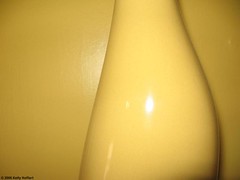
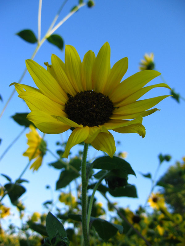
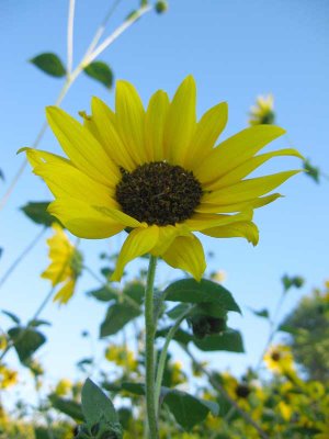
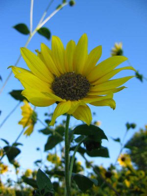
The Challenge:
Kelly approached me with this image:


The main flower in the picture (specifically, the middle circle) is too dark, and lacks detail in some spots. Let's open it up in PS and see what we can do!

The Interface:


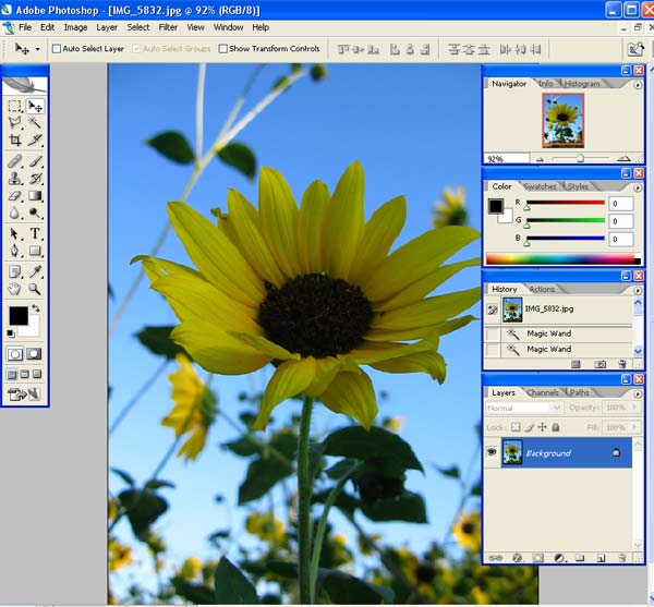
The above image shows the main interface for Photoshop. If you've never used PS before, it may look complicated, but don't worry. The average user can more than likely get by with very little of it and still get a lot done!

The first thing I always do is to create a copy of the background layer. This is for two reasons. First, if you want to see the original picture at any time, all you have to do is hide the layer that you've done the work to, and it's there! Second, the background layer is pretty limited in what you can do to it, so it's always a good idea, just in case. To do this, grab the layer labeled "Background" in the bottom right box, and drag it down to the icon at the bottom of that box that looks like two squares (the "create new layer" icon).

Brightness/Contrast:
The easiest way to adjust light and dark in the image is to simply use the brightness/contrast controls, which are located (in CS2) under the Image menu, under "Adjustments," and then click on "Brightness/Contrast." However, on this particular image, this won't work very well. Go ahead and try it, and you will see that you really can't lighten the flower effectively without lightening the entire rest of the picture way too much!

Levels:
The next tool I'll talk about is a bit more complex, but much more useful in common situations like vacation photos where some jerk put the sun behind you in the shot. Once again, use the Image menu, and select "Adjustments." But this time, click on "Levels." Alternatively, you can just hit CTRL-L to do the same thing. Either way, you will get a dialog box that looks like this:


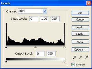
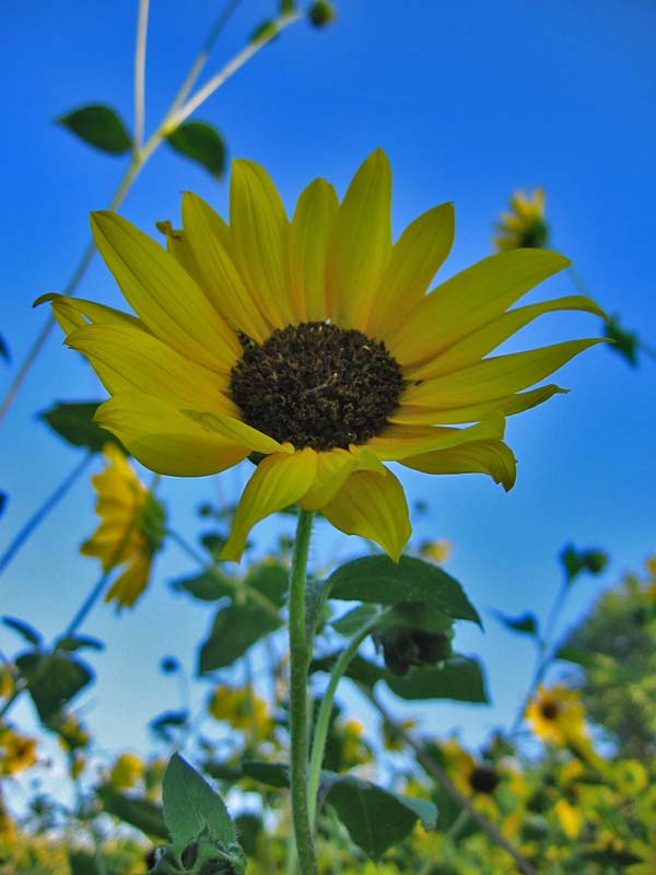
The black chart-thing is called the "Histogram" of the image. It shows the distribution of light and dark tones. If the histogram is squashed to the right side, the image is overexposed. If it's to the left, the image is underexposed. Either way, you will typically want the outer arrows to go close to where the black part of the histogram begins and ends. Moving the right arrow will make the image lighter, and moving the left one will make the image darker. The middle arrow adjusts the midtones. You can also adjust the Red, Green, and Blue channels individually, if you want, but for this one, I stuck with the standard. For this particular image, sliding the middle arrow to the left seemed to produce the best picture. Here's what I got just by using the levels, and about a minute of moving arrows:


A definite improvement, but to really make the picture look good, we need to go into a bit more depth.

Layers:
The last two methods both share the problems of affecting the entire image. To fix this, we will use layers, and adjustment layers. If you don't know what layers are, imagine clear sheets of plastic that can be drawn on, and then stacked on one another. You can see all the way through to the bottom layer, so long as none of the layers above it have been "drawn" on. Each layer is independent from all of the other layers, so you can apply the things I've already talked about to a single layer, or if you want, to all of the layers. This is what I'll call the "layers panel," "layers pane," or "layers box."


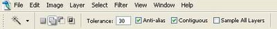
Probably the easiest way to select what we need in this case is to use the Magic Wand tool. Find the icon in the top section of the toolbar on the left side of the screen, or simply press the "w" key. Several options come up directly underneath the top menu bar. One of them should be "Tolerance." Change the value in the box to about 20, and click in the dark area in the middle of the flower. Most of the dark area should now be selected. Hold shift to add to the selection, and click on the parts that weren't caught by the magic wand again, until you get the entire dark part selected.


Quick Tip:
Instead of holding down shift to add, you can change the settings. Just to the left of the tolerance setting is a group of icons that affect selection. The first is "New Selection," which gives you a new selection every time you click the wand. The second is "Add," and the third is "Subtract." These obviously add to or take away from the selection. The fourth, if it's there, is "Intersection," which I hardly ever use. It selects only the intersecting parts of the current selection and whatever you select next.

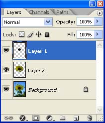
However you do it, select the entire dark part of the flower, and right click on it. On the context menu that comes up, click "Layer via Copy." This will create a new layer in the document, which you can change independently from the rest of the picture.

Repeat this process for as many different layers as you want. I did three on this picture: one for the background, one for the flower (including the dark center part), and one for the center part alone. Remember that the more effort you put into selecting the layers, the better this will turn out. Make sure you go to the layers pane and select the background layer when selecting, or else you won't be able to select properly. When you've got all of your layers, arrange them on the layers pane by simply dragging them up or down, so that the middle dark part is on top, followed by the one with the entire flower, followed by the background image.

Adjustment Layers:
Now, let's talk about adjustment layers. With adjustment layers, each effect is created in its own layer, which you can move around on the layers pane to affect different layers. Adjustment layers can affect every layer below them, or just the layer directly below them. They are great for when you do something that you may want to take out later, because they don't actually affect the image.

First, select the center image, and click the little icon at the bottom of the layers panel that looks like a circle that is half black and half white. Select "Levels" from the pop-up menu, and do basically the same thing you did last time you edited the levels. Notice that a new layer has been created on top of the layer that was selected. This adjustment layer will affect all of the levels below it, which is not desirable in this case. We want it to affect only the center part. Hold the ALT key, and move the mouse to the bottom border of the adjustment layer in the layer pane. Your cursor should change to two black circles. Click while still holding ALT, and the adjustment layer will move to the right, with a little arrow pointing down appearing to the left of it. This means it is affecting only the one layer. Good work! Repeat this process for all of the other layers, lightening or darkening them according to what looks best to you.

Quick Tip:
If you can tell where one layer starts and another begins, you probably should make them a bit less obviously different. Try adjusting the "opacity" setting for the top levels in the layer panel.

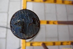
Here's what I got from it (I didn't spend too much time on selecting, but you get the idea):


Shadow/Highlight:
One final method I want to talk about is using the "Shadow/Highlight" feature. This feature is new to CS1, so if you have an older version, you won't be able to use it. Upgrade ASAP if you plan on doing this kind of thing regularly, because it's certainly the easiest and most effective way, hands down.

Start over with the original image (no layers are really needed for this image, but if you wanted to, you could use them.) From the Image menu, select Adjustments > Shadow/Highlight. You can immediately see the improvement in the image, but it gets better. I left the Shadow setting at 50%, and dragged the Highlight setting up to 50% as well. I ended up with this:


So there you have it. You now know three very good and relatively easy ways to adjust the brightness of an under- or over-exposed image! As a final comparison, here are all of them side-by-side.
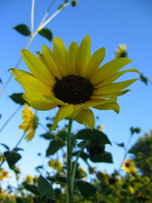
The Results:

Original:


Levels only (~30 seconds):


Levels with Layers (~10 minutes):


Shadows/Highlights (~30 Seconds, Requires CS1 or higher):


Now go find those photos you'd passed up because of bad lighting, and get to work!
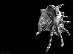
Monday, September 11, 2006

Digital "Zoom"

Many digital cameras come with claims that they have a "digital zoom" in addition to, or instead of, optical zoom. If you have such a digital camera, do yourself a favor right now and get your camera’s manual and find out how to disable this feature. You’ll be much better off without it.

All a digital zoom does is show you fewer pixels from your picture. This apparent zooming acts nothing like a normal optical zoom, and in fact it will reduce the quality of your pictures enormously.

You can get the same, or perhaps better, results if you take the picture without digital zoom and then crop it later on your computer. So turn it off!

Thursday, September 07, 2006

No Excuses!

No assignment this week. That will give people a little more opportunity to catch up. Instead, I want to warn you about the biggest mistake a photographer can make.

I've been involved a bit lately in critiquing the work of others on Flickr. Most people are very good about taking criticism how it is meant. A few people get offended, though. They're not the ones I'm talking about here. I'm talking about people that make excuses for problems with their photos. I'll talk about two I've encountered so far. I'm probably guilty of the same things, but it's something to avoid. I also want to note that these two people are good people with a good attitude, as I've encountered them several times, so don't look down on them for making this mistake.

I want you to make mistakes. But this is the one mistake I want you to avoid. If you make excuses for your work, you won't improve.

I Couldn't Help It

I critiqued one guy's shot of two butterflies, saying that I didn't like the composition. He told me that he didn't think I understood, and that nature doesn't pose for you.

So what!

My response? The final image is the only thing that matters.

Photography is 50% skill, 25% dedication, and 25% luck.

Sure, maybe he did the best he could under the circumstances. I don't really care if he did. If the results aren't good, then I don't care that he found the best possible composition. Drop the picture. Maybe he just wasn't lucky that day. This is where dedication comes in. Wait for another opportunity.

I, myself, have committed this same kind of wrong-headed thinking. I encountered the work of a really good wildlife photographer, got jealous, and thought "Well, sure, it's easy when you have all kinds of money for 400mm lenses and trips around the world." This is not the right way to think. Yes, he does have those advantages, but the dedication is key when you're photographing nature.

"Artistic" Decisions

I also had the pleasure of critiquing the work of a woman who left one face blurry in an otherwise very creative and compelling shot. She defended it as an "artistic" decision.

I don't care.

Yeah, maybe it was an artistic decision. The wrong one. Like I said before, the final image is the only thing that matters. Photography is about results, not that you tried, or that you were being creative. Yes, these things are important to honing your skills, but suck it up. The final image is what counts.

Technical rules are there for a reason. This woman said the following:
[T]echnical rules are not usually right. . . . If I wanted to be a boring commercial photographer I would and could... but I am not merely a photographer... i am an artist LOL I am about feelings not following the "rules".
This. Is. An. Excuse. My response to her? I asked whether Ansel Adams, or Dorothea Lange, or Paul Strand were "artists" or merely commercial photographers. They followed the rules. Were they just commercial photographers? Google them and you tell me.

Don't Be Discouraged

Don't let this discourage you. Take this as a warning. It's easy to fall into the trap of defending your photos. You pour your heart and soul (and time and money) into taking these photos. You develop an attachment to them. Of course you like them!

But when someone critiques your work, even if they're harsh, don't fall into the trap of defending the shortfalls of your work. I'm sure I still do it. Sometimes I'm right. Sometimes I'm not. But you need to seriously consider the possibility that the one critiquing your work is right.

And then again, maybe the critiquer just doesn't "get it." But if they are right, wouldn't you like to learn something from them?

Monday, September 04, 2006

Basic Lens Types

Photographs are, as the Latin name implies, pictures created by light. And the first part of your camera that the light meets is the lens, making lenses a very important accessory for users of SLR cameras. "Normal" lenses are those with a focal length around 50mm. Anything much shorter than that, for example, a 28mm lens, is called a wide angle lens. Anything much longer than that, for example, an 80mm lens, is called a telephoto lens. But most lenses that people use will have a variable focal length, such as 28mm-80mm, or 80mm-210mm, and these lenses are called zoom lenses. When a zoom lens is set at a particular focal length, it will have the properties of a lens with that fixed focal length, so all this knowledge will apply to zoom lenses as well.

This article discusses the three basic lens types, normal, wide angle, and telephoto, and concludes with a short discussion of lens speed to help you avoid camera shake and to buy the best lens.

"Normal" Lenses (about 50mm)

Normal lenses will give you normal results. They are the most similar to using the human eye, and for that reason are often the lens that comes with a camera. Everyone will have a lens that is capable of being set at a normal focal length. These are perhaps the most useful of the fixed focal length lenses.

Wide Angle Lenses (35mm or less)

Wide angle lenses, or those with a short focal length, will allow you to get more into the picture. Say for example that two shooters are standing in the same spot in a subway tunnel. One shooter, who has a 50mm lens, will get a nice picture of the tracks and the tunnel ahead. The shooter with the 28mm lens, however, will not only get the tracks and tunnel, but also the pipes and wires on either side of the tunnel.

The catch is that wide angle lenses will cause distortion of the image. Things at the edge of the frame will curve. This can be used to artistic effect, but most of the time it’s a price you have to pay for using a wide angle lens. This makes them poor candidates for portrait photography, because no one wants their face distorted, their nose enlarged, and their ears shrunk.

On the positive side, wide angle lenses will cause your pictures to appear to have more depth. This creates pictures that will be much more interesting, as a rule.

Additionally, for good or ill, wide angle lenses give your pictures greater depth of field. This means that you can have a fencepost in the foreground, a field in the middleground, and a mountain in the background, and all of them will be in focus. This makes wide angle lenses ideal for most landscape photography. But it is another feature that makes them poor portraiture lenses, because you usually will want only the person in focus.

Telephoto Lenses (70mm or more)

Let’s take the example of our two shooters in the subway tunnel, and let’s add a third shooter. This one has a very nice (and expensive) 400mm telephoto lens. Instead of getting the tracks or the tunnel, this shooter is able to get a picture of the next train coming down the tunnel, even though it’s still a long way down the track.

Telephoto lenses, unlike wide angle lenses, will cause very little distortion of the image. Straight lines will appear straight, as they should, if you shoot them with a telephoto lens. This makes them ideal for portraiture, because your subject will appear as he or she appears in person.

Longer lenses also have a shallower depth of field. This is another plus for portrait photography, because you can isolate your subject very well. And of course, nobody wants you in their face while you’re taking their picture. This would make them uncomfortable.

The downside (or is it a plus?) of telephoto lenses is that they will make your pictures appear flat, as opposed to the great depth given by wide angle lenses.

Finally, telephoto lenses are a must-have for anyone serious about wildlife photography. Most animals won’t let you get in close enough to take their picture without a very long lens.

Lens Speed

One thing to keep in mind when using a longer lens is that you will more often have a problem with camera shake. Recall that a good rule of thumb is that you can shoot at a speed at least the inverse of your focal length: if you use a 200mm lens, you can handhold the camera at 1/200 second or faster, but if you are using a 28mm lens you can handhold it at 1/28 second. This means that telephoto lenses will more often require you to use a tripod.

But that is not what experts mean when they talk about lens speed. All lenses will have a maximum aperture. My wide angle lens for my Yashica FX-7 Super, for example, has a maximum aperture of f2.8. This will be designated as 1:2.8. What does it mean? Remember that wider apertures allow more light into the camera, allowing you to use faster shutter speeds. So my 28mm lens is faster than a lens designated as 1:3.5, but slower than a lens designated as 1:1.4.

Zoom lenses have another issue with maximum aperture. They have a maximum aperture at the shortest focal length, but they usually have a smaller maximum aperture at the longest focal length, meaning that the more you zoom in, the smaller your maximum aperture. The lens that I first got with my SLR, for example, is designated as 42-75mm 1:3.5-4.5. This means that it’s a zoom lens, with 42mm as the shortest focal length and 75mm as the longest focal length. It’s also a very slow (and cheap) lens, with a maximum aperture of f3.5 when zoomed all the way out, and a maximum aperture of 4.5 when zoomed all the way in.

Lenses with a larger maximum aperture are more expensive, but they are also faster and therefore more desirable.