Thursday, November 30, 2006

Assignment 11: Do Something Different

Previous Assignment: Still Life

Are you looking for something different in your photography? Sometimes, working with different equipment can give you inspiration and motivation to take more pictures, and it will force you to think outside the box you've become comfortable with.

One way to do this is to try out a Holga camera. This Wikipedia article has this to say about the iconic Holga:
The Holga is a very inexpensive, medium format box camera appreciated for its low-fidelity aesthetic. . . . The Holga's cheap construction, combined with poor quality materials and simple meniscus lens often yields pictures that display vignetting, blur, light leaks, and other distortions. The often bizarre photographic results of these effects have ironically popularized the camera with an international audience, and Holga photos have won numerous awards and competitions in art and news photography.
An eBay search at the time I write this turned up several Holgas available for under $40 US. The Holga uses medium format film, not 35mm, so the shape of the pictures is different--a great way to make you think differently about photography. Also, the distortions and vignetting caused by the poor construction should make your results even more interesting than you might expect. Some photographers like to try to figure out exactly how any particular Holga might distort the picture, and try to use that to their advantage. Many Holga enthusiasts own several different Holgas (or perhaps even dozens of them), all of which distort pictures in different ways. Holgas also offer many opportunities to modify them.

Another good way to force yourself out of your comfort zone is to get a new lens, or lens filter, or some other piece of equipment that will change the way the pictures will turn out. I've done this a couple times--first when I got my wide angle lens, and second when I got my digital camera.

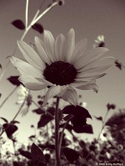
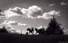
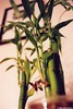
But if you don't want to make that kind of investment, you might try a different kind of film, such as infrared film. I haven't tried this yet (but I think I might real soon), but here's an example of what it looks like:
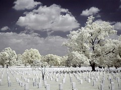
Fallen
(by Cocoabiscuit)

You might want to do some research on what kinds of subjects and atmospheric conditions will give you interesting results, and how to determine correct exposure (trial and error, mostly) before you go out with IR film, and this Wikipedia article is a good place to start. There is also such a thing as ultraviolet photography, but it's much less popular and I believe it requires special filters.

EDIT: I have added a link to a FAQ on infrared photography that appears to be very in-depth, in case you're interested. The link is in the sidebar.

Another way to use film to force you outside your box is by using ultra-high speed film (such as 800 or 1600 ISO film) to put a lot of grain in your shots. To take this to the next level, you can use high speed film, but tell your camera that it's a faster speed than what's really in there (for example, use 800 ISO film and tell your camera it's 1600 ISO). Then you'll have to take it to a nicer photo lab (sorry, not Walgreens) and tell them to push process it.

If you don't have a film camera, you can use a one-time-use camera with a higher speed of film. Even if you do have a film camera, you might want to try this out. There are many things you ca do with one-time-use cameras. There are underwater ones and panoramic ones, and this article has information on modifying them to be pinhole cameras, rather than using a lens, or on reloading them with different film (including infrared film).

I don't have any examples to share with you this week, but a friend has just given me a medium format twin lens reflex (or TLR) camera that I'm going to play around with. It's a Yashica MAT - 124, which has a 1:1 aspect ratio (using medium format film, which is 6cm wide, it produces negatives that are 6cm by 6cm).

Yashica MAT - 124

Yashica MAT - 124 (open)

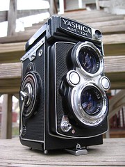
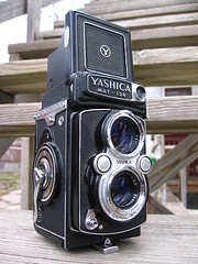
This will force me outside my comfort zone for a number of reasons. First, it takes square pictures, so I can either think about each picture as a square, or plan a crop for each picture that may be different from the normal aspect ratio that I'm used to. Second, the viewfinder is quite different. You look in the top of the camera, so you hold it at chest or waist height, quite different from the eye level that I'm used to. It also shows everything in reverse (if you move the camera left, the image moves right). And finally, it's a lot more work to use a completely manual, TLR, medium format camera like this, especially when compared to a digital point-and-shoot like I'm used to, so a lot more planning will go into each shot.

When you try something different, why don't you share it with the group, and explain what you did differently?

Tuesday, November 28, 2006

David Plowden Quote

Have you ever lacked inspiration? Didn't know what motivates you to take photographs? Here's one great photogapher's take on inspiration and motivation:
I was born astride two eras. The fact that the demise of the steam locomotive and the beginning of my career occurred simultaneously was a coincidence that determined the course of the rest of my life. It was that initial sense of loss—and perhaps that my father died later the same year--that greatly influenced the way I view the world. It also made me keenly aware of photography’s unmatched ability to preserve the moment and, thereby, to capture things on film before they disappeared. It began to dawn on me that I hadn’t simply been documenting steam locomotives in their final hour. I was witnessing something of far greater consequence: the transformation of a culture. In this light, the body of my work depicts an America almost unrecognizable from the one I began photographing forty years ago. The urgency to record has become ever more imperative as I have tried vainly to stay one step ahead of the wrecking ball. . . .
To those familiar with my photographs, it may appear that I have spent my life glorifying works of an age past, that I have tried to enshrine them with an immortality before they vanish. I am filled with a sense of loss, but not just the loss of steam engines, iron bridges, small farms, and the stores of Main Street. I am distressed by what I perceive as a pervasive disregard for the future. I do not hear "America singing" anymore.
--David Plowden, in his preface to Imprints

Friday, November 24, 2006

Anonymous Quote

If you saw a man drowning and you could either save him or photograph the event...what kind of film would you use?
--Anonymous

Wednesday, November 22, 2006

How-To: Split Toning

Take a look at these black and white pictures.

Sunflower in Monochrome

Hay Bales in Field

Jack's Place

They look pretty nice, don't they? The secret is, they're not exactly black and white. They use split toning to achieve an extra bit of contrast and overall pleasing tone. People have done it for decades in the darkroom, and you can do it with your black and whites, too.

EDIT: Split toning is the application of different color casts to different tonal ranges in the photo (e.g. the shadows and highlights).

The first step is to open up your picture in Photoshop. If it's already a black and white, you're golden. If it's not, then let's convert it to black and white first. My favorite method goes as follows:

1. Look at the "channels" tab in your layers palette. See which channel has the best look for your photo, the red, the green, or the blue. Maybe two of them have some elements that you like. When you get it figured out, click back on the layers tab.
2. Go to Image > Adjustments > Channel Mixer. Click the box that says "Monochrome," and then adjust the sliders however you want. If the red channel looked the best, leave it as is, otherwise move the sliders to where your pic has the best overall look. Make sure the numbers add up to 100. When you're satisfied, click OK.
3. If your image is now too dark or too light, now's the time to fix it by going to Image > Adjustments > Levels.

Now that we're all up to speed with the black and whites, it's time for the split toning.

1. Go to Image > Adjustments > Variations.
2. Make sure the box that says "Show Clipping" is not checked. Normally it starts out checked, so turn it off. (I honestly have no idea why this is, but it's how it was explained to me.)
3. Now, unlike the effect I showed you in the post on silhouettes, this time we want a subtle effect. So take the slider there all the way down to the "fine" end.
4. Now, for the fun part--the real split toning.
4.a. Click on the "shadows" button first. Think about color theory here. Warmer colors, such as red and yellow, tend to pop out a bit more, while cooler colors tend to recede into the background. If you want the darker areas to pop out, try using red or yellow. Most likely, however, the darker areas will be further back into the picture, so try magenta or blue, or maybe green. Just do two to four clicks in the box you've chosen.
4.b. Now click on the "highlights" button. We'll leave the midtones alone, because changes there will be too obvious. Think about the color you chose for the background, and again think about color theory. Combinations that I've found work well are
- blue shadows, cyan highlights (particularly in pictures of snow and ice)
- green shadows, blue highlights (as in "Jack's Place" above)
- red and/or magenta shadows, yellow highlights (as in the other two pics above, in which I used a little bit each of red and magenta for the shadows)
And of course you can play around with different combinations. Start out with two to four clicks here as well.
5. Now, click OK. If you're unhappy with your picture (wrong colors, too much color, too little color), undo (Ctrl+Z) and go back into variations to try it again. My suggestion would be to save it as the original filename plus a letter/number, such as IMG_0001_a, then undo, go back into variations and try a different method, then save the new one as IMG_0001_b, and so on, to find the one you like best.
6. The final step is to share your results with the group!

(Note: I must give many thanks to Popular Photography & Imaging Magazine, where I learned about this technique. While my article closely follows their instructions, it is not a copyright violation because I only copied facts, not the expression of those facts. This article also incorporates my own observations, opinions, and advice.)

Tuesday, November 21, 2006

Rineke Dijkstra Quote

As a photographer you enlarge or emphasize a certain moment, making it another reality. In the photograph you can scrutinize all kinds of details, you can see things you normally would not pay so much attention to.
--Rineke Dijkstra

Sunday, November 19, 2006

Add Drama By Cropping

Just a quick tip: you can add a lot of drama to your photos by cropping them to an extreme vertical or horizontal. Just compare these two versions of the same shot and you'll see what I mean:

A Tree in Fog (old version)

A Tree in Fog

The best way to do this, however, is to plan the crop before you even click the shutter. That way, the cropping will be easier, and you'll be able to plan out your drama even better. I know I'm in favor of cropping in-camera (i.e. framing the photo perfectly before you click) but often this is the best way to take a shot.

Another quick tip to remember is that vertical pictures are more dramatic than horizontal pictures, so for a real big boost in drama you can try an extreme vertical crop, like here:

Pink Crab Apple Blossoms II

A good place to see this in action is the Bookmark Crop group on Flickr, which right now has only 150 photos but is still an excellent source to see what I'm talking about here.

Thursday, November 16, 2006

How-To: Vignetting

This Wikipedia article defines "vignetting" as "a reduction in image brightness in the image periphery compared to the image center." This is often used as a creative device in photography to draw your eye toward the center of the picture, and sometimes to create drama. Many photographers simply prefer vignetting on their images as a rule, rather than the exception. I don't think that's a good idea, but every once in a while you'll get a picture that already looks good with a centered composition (an unusual thing indeed) and you might want to make it even better with vignetting.

This week, instead of an assignment, I'll share the evolution of a so-so capture into a powerful, dramatic, and yet playful image in the tradition of Homeward Bound, and at the end of it I'll explain how you can add vignetting to your own pictures.

The original:


It's very difficult to get a good capture of dogs, especially when they're playing and moving around more than usual. Here I set myself up pretty well to get an interesting and dramatic composition. But as you can see, there's a lot of excess in this picture. I cropped the right side out, up to the tree. Then I cropped the top and bottom a bit, to retain the drama and eliminate unwanted details.

There was some dust on the lens, and since I was pointing in the direction of my light source (the sun) they showed up as white specks. I used the clone stamp tool to eliminate this problem.

Then I converted to black and white. To follow how I did that in more detail, read the article on silhouettes. In short, I went to Image > Adjustments > Channel Mixer, clicked the "Monochrome" box and for this picture I left the red channel at 100% because of the nice contrast it gave to this picture.

Vignetting

Then comes the step you've been waiting for. As I understand it, the latest version of Photoshop, CS2, has a special vignetting tool. But for those of you, like me, who are stuck using an older version of Photoshop, this tutorial will help you. I believe this trick will work in all versions of Photoshop beginning at version 5.

The first step is to go to Layer > Duplicate Layer. This creates an additional layer identical to your background.

The second step is to darken the background layer appropriately. Click the eye next to your new layer in the layers palette, so you can see the original layer only, and click on the original layer. Now go to Image > Adjustments > Levels. Grab one of the rightmost sliders (either under the histogram or the output levels) and move it left until you think the edges are as dark as you want the darkest point to be. Don't overdo it at this step, or your picture will look cheesy rather than dramatic. Also, you can always go back and make it darker if you want, but making it lighter will be more difficult.

Now click the eye on your top layer again, and your picture will go back to normal. Make sure you click on the top layer in the layers palette as well, so we can be sure you're working with that layer and not another one.

The next step is to add our layer mask. For this, you'll want the elliptical marquee tool. This should be the top left icon in the toolbox palette. If a different marquee tool is there, such as the rectangular marquee, you'll have to hold down that button and a smaller window will open where you can select the elliptical one. Now, use that tool to select the area of your picture that you want to stay normal. In other words, everything outside it will fade as part of the vignette. After you're happy with your selection, look at the layers palette again. There are several tiny little icons at the bottom of it. Put your cursor over each one and wait for the little help message that says "Add Layer Mask." It should be the second from the left. Click that one.

Now you'll have a hard line between your regular-looking picture and the darker area around it. This isn't very pleasing to the eye, so let's make it into true vignetting.

Now, to the final step. On your top layer in the layers palette there will be two little thumbnails. Click on the one to the right (the plain white box), which is the layer mask itself. Then go to Filter > Blur > Gaussian Blur. Make sure the preview box is checked. Now, mess with the radius until there is an amount of fade that you like, and then click OK.

And that's it! You have your dramatic vignette. If you want to adjust things, undo the gaussian blur to change the amount of fade, or go back to the original layer and make it darker if you want. You could, I suppose, change your original layer to all-white or all-black, but to me that looks kind of corny. But again, some people like that, and they might even put some flowery, frilly stuff around in the empty space too. But that's not for me.

Here's my result:

On the Brink of Adventure

If you add vignetting to your photos, why don't you share it with the group?

Monday, November 13, 2006

Paul Caponigro Quote

In my years of photography I have learned that many things can be sensed, seen, shaped, or resolved in a realm of quiet, well in advance of, or between, the actual clicking of shutters and the sloshing of films and papers in chemical solutions. I work to attain a "state of heart," a gentle space offering inspirational substance that could purify one’s vision. Photography, like music, must be born in the unmanifest world of spirit.
--Paul Coponigro

Thursday, November 09, 2006

Assignment 10: Still Life

Previous Assignment: Critique

This week, I want you to try a still life shoot. This will help out your photography skills immensely. It will teach you about composition and color, and will bring together many of the other lessons you've learned.

Still life is probably the easiest form of photography. This is because you can move your subject around in any way you choose, rather than just having the option of moving yourself and your camera. And I recommend that when you do it, you move your subjects around quite a bit, to find the most pleasing arrangements.

Note that you'll probably need a tripod, since you'll be indoors. Make sure to turn your camera's flash off, and most of the time you'll want to make sure your camera is set to focus on closer objects (on many cameras, this autofocus mode will be called "macro mode" and may be represented by a flower icon) or that you're using manual focus.

To do it, first figure out what your subject will be, and how that will affect your choice of a background. You may want to just go to your desk and arrange the things you find there into a pleasing composition. There may be other locations in your house or office that have the elements you need in a location that will work. In the alternative, you may want to do fruit or flowers. If so, find a location that will work for that. If you have a nice-looking table, then you may want to use it. Otherwise, it might be a good idea to get a piece of poster board, probably white poster board, to eliminate any background distractions. Or you may want to use the information in my post entitled How-To: Floating in Space.

Wherever you decide to do your shoot, it may be a good idea to have light that you can move around. It would be ideal to have professional lighting equipment, but a simple lamp will do the trick.

Your next step is to bring all the elements together. If you have antiques, like antique cameras, typewriters, or whatever, they might be a good first step. On the other hand, you may want to go to a grocery store and buy some nice, ripe, unbruised fruit. When you choose it, don't think about taste, as you normally would when shopping for food. Think in terms of pleasing colors and textures, or unusual shapes. If you go with this route, you may want to pick a bowl that will complement the backdrop and the fruit.

Arrange your subjects, and shoot. If you're doing fruit, it's a good idea to start by taking pictures of the whole fruit first, and later to slice it open to reveal the inside goodies. After you cut it, remember that many fruits (such as apples) will start to change colors rather quickly, so don't mess around.

While shooting, make sure to move yourself and your subjects around to find as many pleasing compositions as possible.

Here are a few examples, just to get you thinking about color, texture, and arrangement:

Orange Bell Peppers

Snail Shell

Green Beans and Raspberries Daffodil Stems in Vase Orange-Lime
Bamboo from Below Jack Daniel's

Now go out, shoot, and share!

Next Assignment: Do Something Different

Tuesday, November 07, 2006

Bokeh

Bokeh (from the Japanese boke ぼけ, "blur") is a photographic term describing the subjective aesthetic qualities of out-of-focus areas in an image produced by a camera lens.
--Wikipedia article (footnote omitted)

Bokeh is much more important when your depth of field is shallow. It's something that is essentially beyond your control, as it's determined entirely by the lens you're using (both flaws in the glass and the shape of the aperture). It's also very subjective, but most consider good bokeh to be very fuzzy, soft blur, while bad bokeh will be sharper shapes.

There's no real way to quantify it, so it's hard to evaluate. But it seems to be gaining in importance in the US, while it's been important in Japan for many years. Some day you may expect to hear about bokeh on a regular basis when asking for critiques of your photos.

Monday, November 06, 2006

Diane Arbus Quote

I never have taken a picture I’ve intended. They’re always better or worse.
--Diane Arbus


(photographer and copyright status of this portrait unknown--if this is an unfair use and you have authority to object to it, please contact me)

Thursday, November 02, 2006

Assignment 9: Critique

Previous Assignment: Leading Lines

Let's try something a little bit different this week.

I've mentioned again and again what a great benefit you can get from critiquing the work of others. Yet in the group so far I've been the only one to give any critiques. I realized, though, that maybe you don't know what you're looking for in a critique. So here's a checklist that you can go down. Not all of these will necessarily apply in every case, but it's a good place to start. The technical issues apply to almost every picture, but the compositional and creative issues may not. The compositional issues are also creativity issues, but I've separated them because composition is always important to a photo, whereas creativity is much more subjective and complicated.

There might be a few jargon words in here that you may learn. I may come back and add to this list later, in case I missed something. After the checklist, I'll give a few famous examples for you to critique. If you figure out why they're good, or what's wrong with them, you'll be able to apply that knowledge in your own work.

The Checklist

Technical Issues
Focus: Is the picture in focus, or is the focus too "soft"? Is the focus in the most interesting place, or is it misplaced?
Depth of Field: Is the DoF appropriate to the picture? Is it too shallow, leaving interesting elements out of focus? Or is it too deep, allowing for too many distractions in the background?
Blur: Is the picture blurred from camera shake? Are moving objects in the picture blurred (sometimes this is good, sometimes not)?
Exposure: Is the picture underexposed (too dark)? Is it overexposed (too light)? Is the lighting too harsh? Are certain details "washed out" (areas too dark on the picture are less of a problem than areas that are too light)? Is the exposure uneven (some areas too dark, some too light)?
Tones (for monochrome pictures): Are the tones pleasing to the eye? If there is some added color, is it pleasing? If the picture has an overall color cast (such as blue or sepia), is it pleasing to the eye and appropriate to the subject?
Colors (for color pictures): Are the colors accurate, or was there a color shift? Are the colors vivid enough (in other words, is there enough saturation)? Are the colors muted, and if so, is it pleasing in this composition?
Distortion: Are lines in the image distorted due to the shape of the lens, and if so, is it distracting?
Bokeh: Is the bokeh pleasing to the eye? (This is rarely considered important to Westerners, but in Japan it's very important. I will post more on it at a later date.)

Compositional Issues
Overall: Is the overall composition pleasing? Does it follow the rule of thirds or the golden ratio?
Busy: Is the composition too busy?
Slant: Is there an unsettling or distracting slant to the picture, such as a tilted horizon (especially for water images)?
Distractions: Is there a distracting element in the image, such as a sign in the middle of a peaceful forest scene or a tree that seems to be growing out of a person's head?
Leading Lines: Does the photographer make good use of leading lines?
Patterns and Textures: Are there interesting patterns and/or textures in the image?
Light and Shadow: Is the lighting interesting and dramatic, or are there interesting shadows in the picture? (more on that here)
Illusions and Reflections: Are there interesting illusions and reflections in the picture?
Point of View: Has the photographer chosen an interesting POV, or is it dull and everyday? Does it send a message of power, size, or importance? Does it shed new light on the subject?
Perspective: Has the photographer made use of linear or spatial perspective?
Action: Is there interesting action in the image, and does the action move into, rather than out of, the picture?

Creativity Issues
Originality: Is this something new, or have we seen it a million times before?
Appropriateness: Were the photographers choices of how to display the subject appropriate to that subject, or did they do something inappropriate? Does the background complement the subject? Did the photographer give the picture a weird Photoshop treatment? For example, sepia is good for an old steam engine or someone dressed up as a cowboy, but not for high-tech computers or brand-new cars. Adding a glow to the picture is appropriate for a picture of a new mother and a baby, but not to a couple of guys hanging out.
Edginess: This is the flip side of appropriateness. If the photographer does something inappropriate, it may be to good effect. For example, posing a woman in a wedding dress provocatively is creative and unsettling, putting a typewriter into a modern office setting will catch people's attention, or showing a child from a low POV with a strong sense of depth will make him appear huge and strong rather than small and needy.
Breaking the Rules: Sometimes (although rarely), breaking a technical rule can send a powerful message, or set the picture apart. Did the photographer take any risks, and did they pay off?
Meaning: Does the picture have any meaning? Does it say something to you?
Et cetera: Is there anything else particularly creative about the picture?

The Examples

Here are a few pictures that you can critique using this checklist.


"Steerage" by Alfred Stieglitz


untitled by Paul Strand


"Migrant Mother" by Dorothea Lange


"Old Typewriter" by Wynn Bullock


"Marilyn Monroe During the Making of 'The Misfits'" by Henri Cartier-Bresson

If you want, you can share your critiques in a comment in this thread, or share them with the group.

Next Assignment: Still Life

Wednesday, November 01, 2006

Alan Bennett Quote

One glibly despises the photographer who zooms in on the starving child or the dying soldier without offering help. Writing is not different.
--Alan Bennett